Project type: Visual Identity
Client: Casa Mauletta Bed & Breakfast
Time: Fall 2022
In a very special Bed & Breakfast in a centuries old stone house on an Umbrian hill side exists nordic quality along side italian tradition. Casa Mauletta welcomes visitors from all over the world into their world of complimenting contrast.
The identity for this unique holiday spot is rooted in a concept of contrasts. The meeting between the Italian and the Danish, the modern and the traditional, and the familiar and the luxurious. The brand identity is colourful, personal, and inviting, just like the place and the people who own and run it. The design encourages relaxation and being oneself, without compromising on quality.
The identity work include the basics, logo, colors, typography, photostyle, animations & a graphic element as well as packaging for the juicy olive oils produced locally on site for the guest to enjoy.
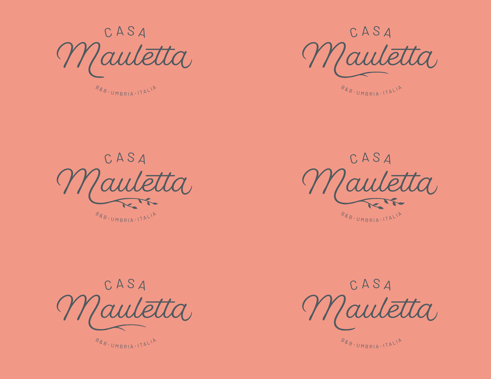
The primary feature of the logo is the typographic word "Mauletta" in a flowing script font. Added to the word is an olive branch, which points to one of the most beautiful aspects of the place - the olive grove. The hand-drawn typography harkens back to something traditional, handmade and human, closely aligned with Italian culture and tradition.
The secondary text creates a contrast to the flowing script with its slightly tighter geometric shapes and light minimalism drawing parallels to the Nordic design values.
The two typefaces in use are Barlow and Fairwater Script. These two distinct typefaces contribute to creating the contrast between the Italian and the Nordic styles.
The color palette is inspired by Italian nature and culture, with references to olive trees, terracotta tiles, and grape clusters. In addition, a distinct dark blue is added to create a traditional and quality-conscious contrast to the muted earth tones. The six core colors in the middle each have a light and a dark shade, making the color system easy to use in any context.
Imagery should be taken from the beautiful area surrounding Casa Mauletta. Both close-up shots of details, photographs of architecture, scenic views and of the people one can encounter at the location. The colors of the photographs are natural without too many loud plastic elements in vibrant colors.
The label on this years olive oil harvest was this year inspired by the tragedies in Ukraine and used the colours of the Ukrainian flag. The design of the label stays the same, but the color changes each year.
As an addition to images, colors and logo, the visual identity also entails a graphic element that supports the concept of the contrast between the traditional and the modern. Older stock or archival photos depicting Italian motifs are given a duotone color grade, Gaussian blur, and added noise to create a sense of time standing still.
Additionally, they are graded with colours from the color palette to tie the identity together. These illustrative images can be used to set a mood or in cases where there are no available original images. The images will always be cropped into a circle to make them less realistic and more illustrative.


